Accessibility: The Key to Reaching More Customers in 2025
Diego Vicente Cabrera
11 Sep 2025 . 5 min read
Accessibility isn’t a “nice to have” anymore—it’s table stakes. Roughly 1 in 6–7 people worldwide lives with a disability, and many more deal with temporary or age-related limitations. If your store isn’t usable for them, you’re leaving money on the table and risking brand trust. The upside: the same fixes that help accessibility also lift conversion, SEO, and mobile UX.
Why it matters (beyond compliance)
More revenue: Inclusive UX widens your addressable market and drives repeat purchases and referrals.
Better UX for everyone: Captions help people watching on mute; high contrast helps in sunlight; keyboard support helps power users.
Aging customers: Seniors are a fast-growing segment; accessible sites win their business.
SEO lift: Semantic HTML, headings, and alt text make your content easier for search engines to understand.
The legal snapshot
U.S.: Courts and the DOJ treat business websites/apps as “public accommodations” under the ADA. Lawsuits are rising.
EU: The European Accessibility Act begins enforcement June 28, 2025 for digital products/services (including e-commerce). If you sell in the EU, you’re on the hook.
Elsewhere: Canada (AODA), the U.K. (Equality Act), Australia, and others expect WCAG-level accessibility. Safer target: WCAG 2.1/2.2 AA.
Quick wins: fix these first
Add alt text to all meaningful images; use alt=" " for decorative ones.
Increase color contrast (aim ≥ 4.5:1 for body text). Watch placeholders, buttons, and text over images.
Make everything keyboard-operable (Tab/Enter/Space). Keep a visible focus style. No keyboard traps in modals.
Label every form field with a proper
Announce changes (errors, “added to cart”) with ARIA live regions; give icon-only buttons an aria-label.
Add a “Skip to content” link for faster navigation.
Tools your team can use (free)
WAVE (visual checker) to spot missing labels, low contrast, etc.
Axe DevTools for developer-level audits.
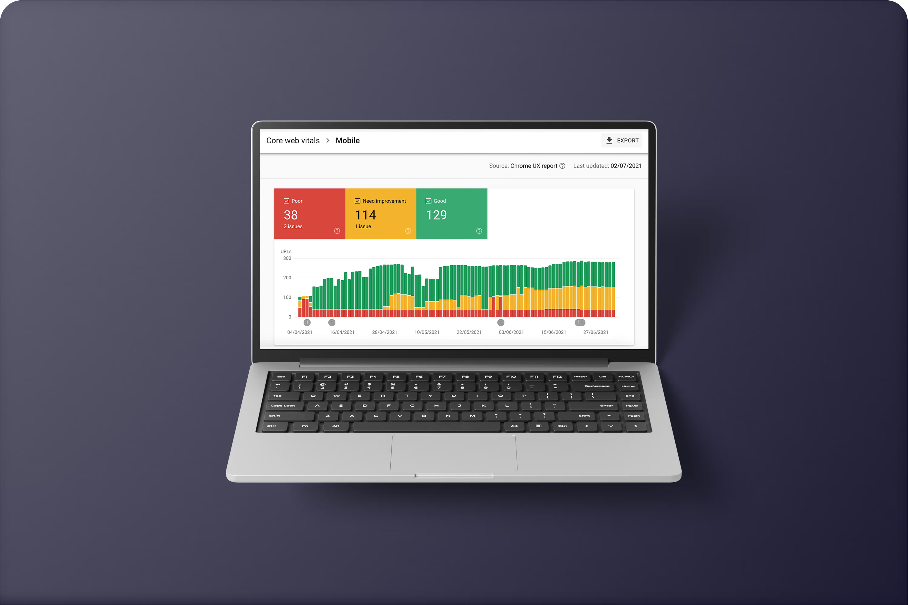
Lighthouse (Chrome) for a quick accessibility score and fixes.
Run on: homepage, PLP, PDP, cart/checkout, login, and any promo modals.
What good looks like
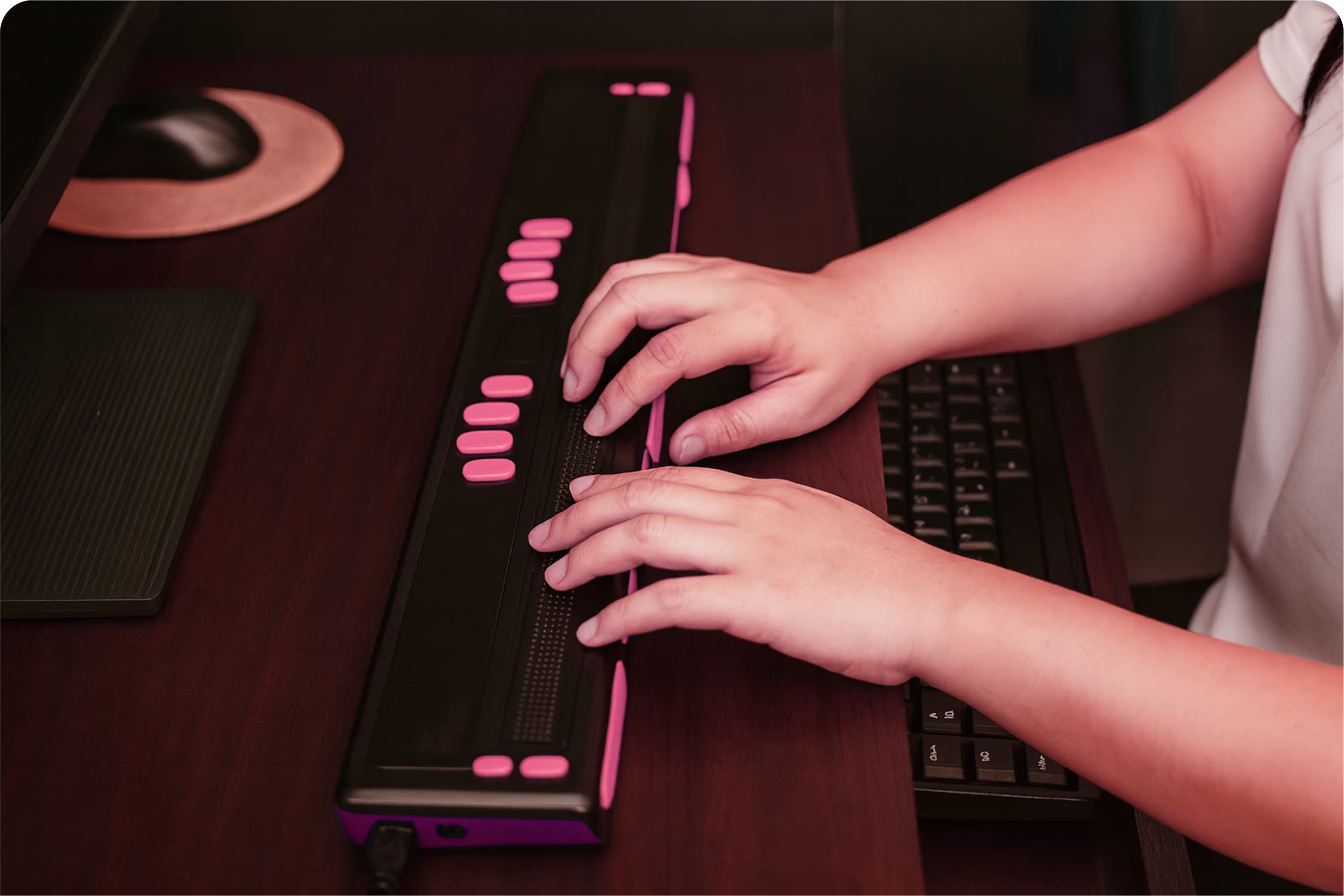
Shoppers can navigate, read, and buy with a keyboard only or a screen reader.
Text is readable on mobile in bright light.
Forms are effortless and errors are announced clearly.
Your Lighthouse accessibility score is 90+ and you have a short Accessibility Statement with a contact email.
Make it a habit
Bake accessibility into your design system, content guidelines, and QA. Do a quick check before launches and when you add components like carousels, tabs, or modals.
Need Help?
At Difvision, we run accessibility audits, fix the high-impact issues fast, and set up simple guardrails so your team can keep shipping accessible features with confidence. Whether it’s an e-commerce store, a corporate site, or a SaaS platform, we’ll help you identify barriers and remove them before they cost you customers or compliance headaches.
Want to know where you stand? Contact us for a quick health check—we’ll walk your key user flows, highlight what’s working, and give you a plain-English checklist of what to fix next.
Accessibility shouldn’t be overwhelming. We’ll make it simple, practical, and actionable.